

The Psychology of the Click: Value vs Effort
Every decision a website visitor makes is a rapid psychological calculation: Perceived Value vs Perceived Effort. If the expected reward of an action exceeds the mental, financial, or time investment required, the user clicks. If the perceived effort or risk feels heavier than the reward, the user hesitates and abandons.
Your call-to-action (CTA) button is the exact physical nexus where this psychological transaction takes place. It is not merely a styled rectangle; it is the final threshold between curiosity and commitment. Yet thousands of companies still rely on bland, uninspired button copy like "Submit", "Continue", or "Click Here".
Why Friction Words Like "Submit" Kill Decision Momentum
In behavioral psychology, certain words trigger subconscious resistance. Words like "Submit," "Register," "Apply," and "Pay" are known as high-friction words. They describe the chore the user must perform rather than the benefit they will enjoy.
When someone is already anxious about cost, security, or time, a button demanding that they "Submit" feels like homework. High-converting button copy flips this dynamic entirely by replacing chore-oriented language with value-oriented language.
The "I Want To..." Copywriting Formula
One of the most effective and reliable formulas in conversion copywriting is completing the sentence starting with "I want to..." from the customer's perspective.
Before publishing any button, test it against this simple prompt:
- Does a visitor wake up thinking: "I want to submit"? No.
- Do they think: "I want to receive my customized marketing plan"? Yes.
- Does a shopper think: "I want to register an account"? No.
- Do they think: "I want to unlock wholesale pricing"? Yes.
By phrasing your buttons around the customer's intrinsic motivation, you remind them why they engaged with your page in the first place.
Button Copy Transformation Matrix (Generic vs High-Converting)
| Business Objective | High-Friction Generic Button | High-Converting Benefit Button | Underlying Psychological Lever |
|---|---|---|---|
| SaaS Free Trial | "Sign Up Now" | "Start My Free 14-Day Trial" | Emphasizes zero cost and personal ownership ("My") |
| Lead Magnet Download | "Submit" | "Send Me the Free Playbook" | Frames action as receiving an asset, not surrendering info |
| Webinar Registration | "Register" | "Save My Seat (Live Session)" | Introduces subtle scarcity and personal inclusion |
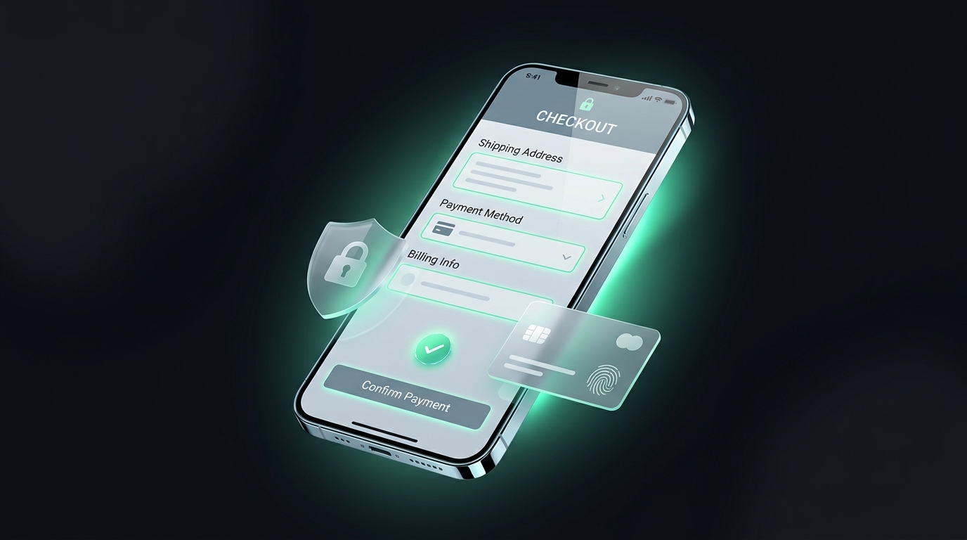
| E-Commerce Checkout | "Continue to Payment" | "Complete My Order & Save 15%" | Reiterates the financial incentive right at the payment step |
| Consultation Booking | "Contact Us" | "Book My 15-Minute Strategy Call" | Defines clear time commitment and actionable agenda |
First-Person ("My") vs Second-Person ("Your") Framing: What the Data Shows
One of the most widely replicated findings in digital copywriting originated in a famous test by Michael Aagaard, where changing button copy from "Start your 30-day trial" to "Start my 30-day trial" produced an astonishing 90% increase in clicks.
Why does first-person phrasing work so powerfully? Because it creates a sense of immediate psychological possession. The customer mentally claims the solution before they even complete the transaction. While second-person ("your") still functions well, testing first-person phrasing on consumer-facing products is one of the quickest experiments any growth marketer can run.
Click Triggers: The Micro-Copy That Neutralizes Last-Second Doubt
A click trigger is an explanatory reassurance phrase placed immediately below or beside your primary CTA button. When a visitor's cursor hovers over a button, last-second micro-anxieties flare up: "Will I be billed automatically? Will this take twenty minutes to set up? Will they spam my inbox?"
Placing three brief reassurance bullets directly under the button neutralizes these doubts at the precise moment of action:
Visual Hierarchy, Contrast, and Placement Principles
You cannot convert a button that visitors fail to notice. While marketers often obsess over specific hues (debating whether green beats orange), the real determinant of visual efficacy is relative contrast against the surrounding layout.
- The Squint Test: Step back from your monitor and squint until the page blurs. Does your primary CTA still clearly stand out as the dominant focal point? If it blends into your page's secondary colors, your contrast is insufficient.
- Touch-Target Ergonomics: On mobile screens, buttons must measure at least 44 × 44 pixels to accommodate human fingertips comfortably without accidental mis-taps.
- Whitespace Breathing Room: Crowding a button with paragraphs, icons, and borders dilutes its prominence. Surround your button with generous whitespace to draw the eye naturally.
Case Study: How Rephrasing a Single Button Generated $120,000 in Incremental ARR
An enterprise project management platform offered a free team tier. Their original landing page hero button read: "Sign Up for Free". The team ran an A/B test over 4 weeks against a challenger variant: "Create My Free Workspace & Invite Team" with a click trigger reading: "Free forever for teams up to 10 • No credit card needed".
The challenger achieved a 24.6% increase in completed workspace creations. Because team onboarding was baked directly into the button expectation, trial-to-paid upgrade velocity increased by 18%, generating over $120,000 in annualized incremental recurring revenue from a single copy tweak.
Summary Checklist for High-Converting CTAs
- Does your button complete the sentence starting with "I want to..."?
- Have you purged high-friction words like "Submit", "Register", or "Continue"?
- Did you test first-person pronouns ("My" vs "Your")?
- Is there a concise click trigger addressing time, cost, or commitment directly below the button?
- Does the button color strongly contrast with your background and secondary palette?
- Is the button large enough (at least 44px height) for effortless tapping on mobile screens?
Conclusion: Treat Your Buttons as Doors, Not Dead Ends
Your call-to-action button is not just the final element on a landing page—it is the catalyst for the entire commercial relationship. If your button copy sounds like compliance or unpaid labor, buyers will hesitate. But when your button reflects the exact value, transformation, or asset your customer desires, clicking becomes the natural, exciting next step.
Review every primary button across your digital touchpoints today. Replace high-friction words with outcome verbs, frame the copy around what the user receives, add reassurance click triggers underneath, and ensure bold visual contrast. A single well-phrased button can be the difference between a bounced visitor and a lifelong customer.